
SK Branding Film - Happy Color Song
GRAPHIC DESIGN AND MOTION GRAPHICS
Credit
Client : SK
Agency : SM C&C
Director : Moon Hee
PD Production : BIGINSQUARE
Graphic Artist :
Kim eun-gun
Lee sang-hee
Cha seung-hyeon
Shin Chang-joon
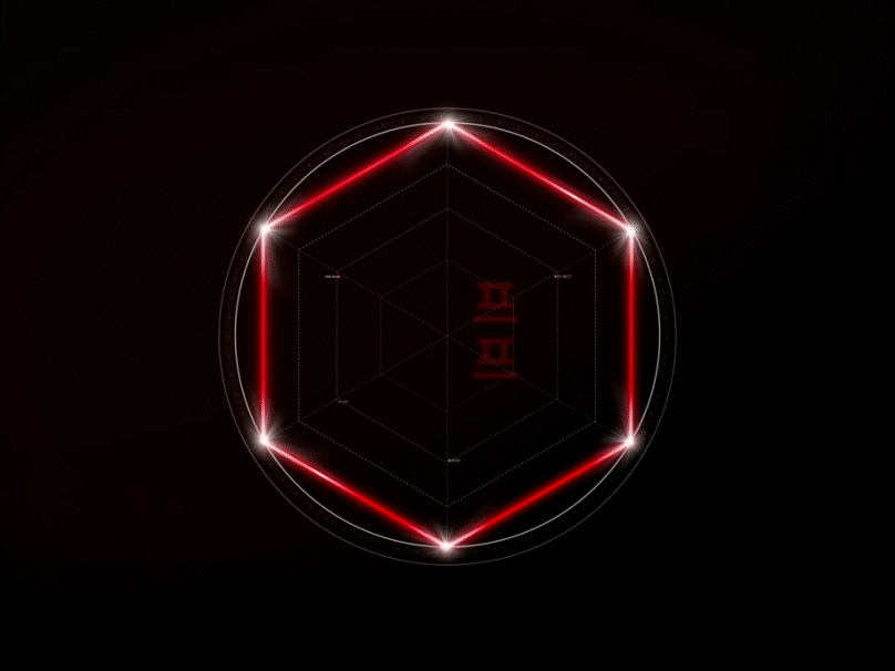
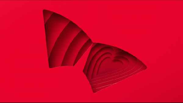
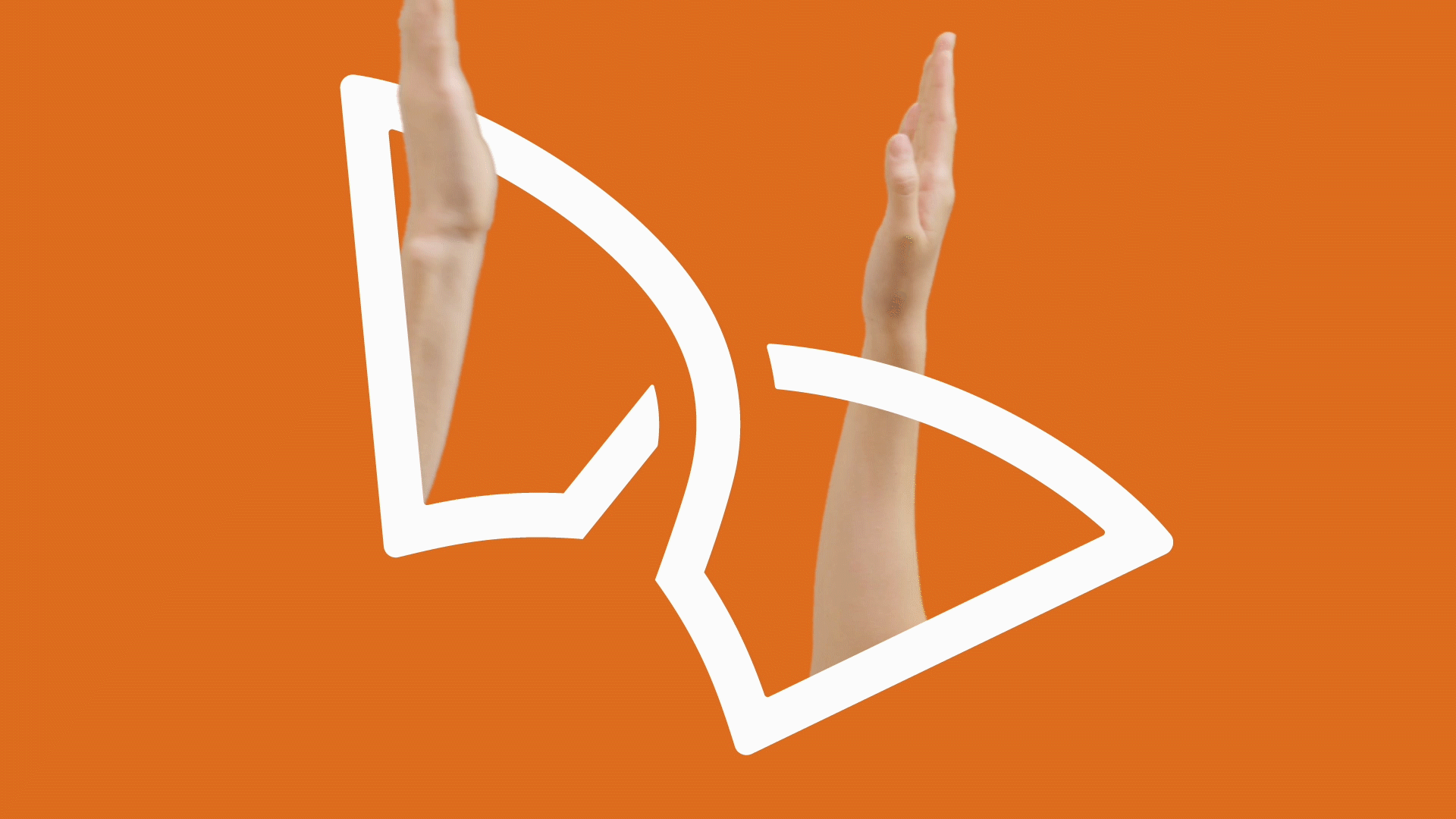
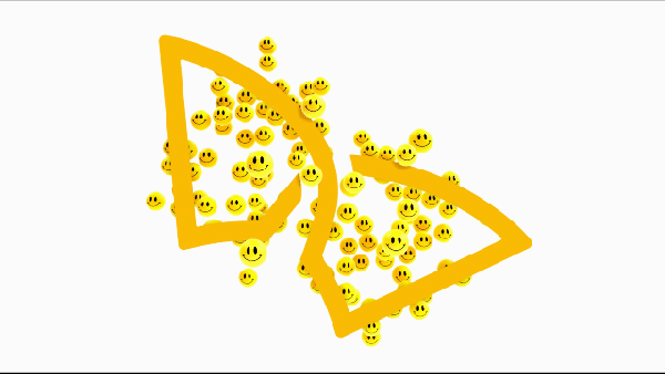
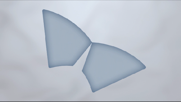
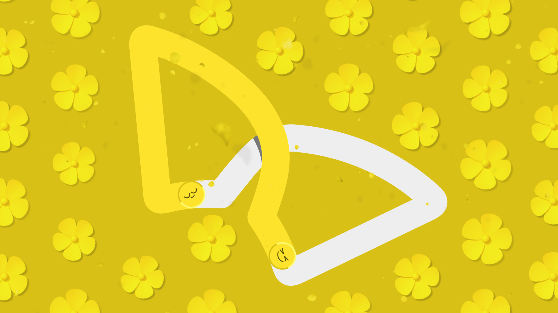
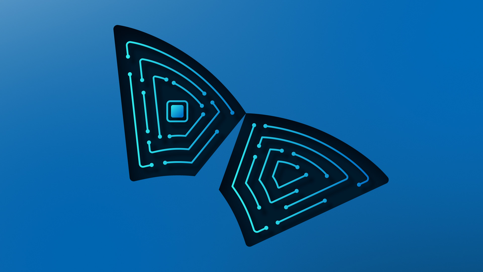
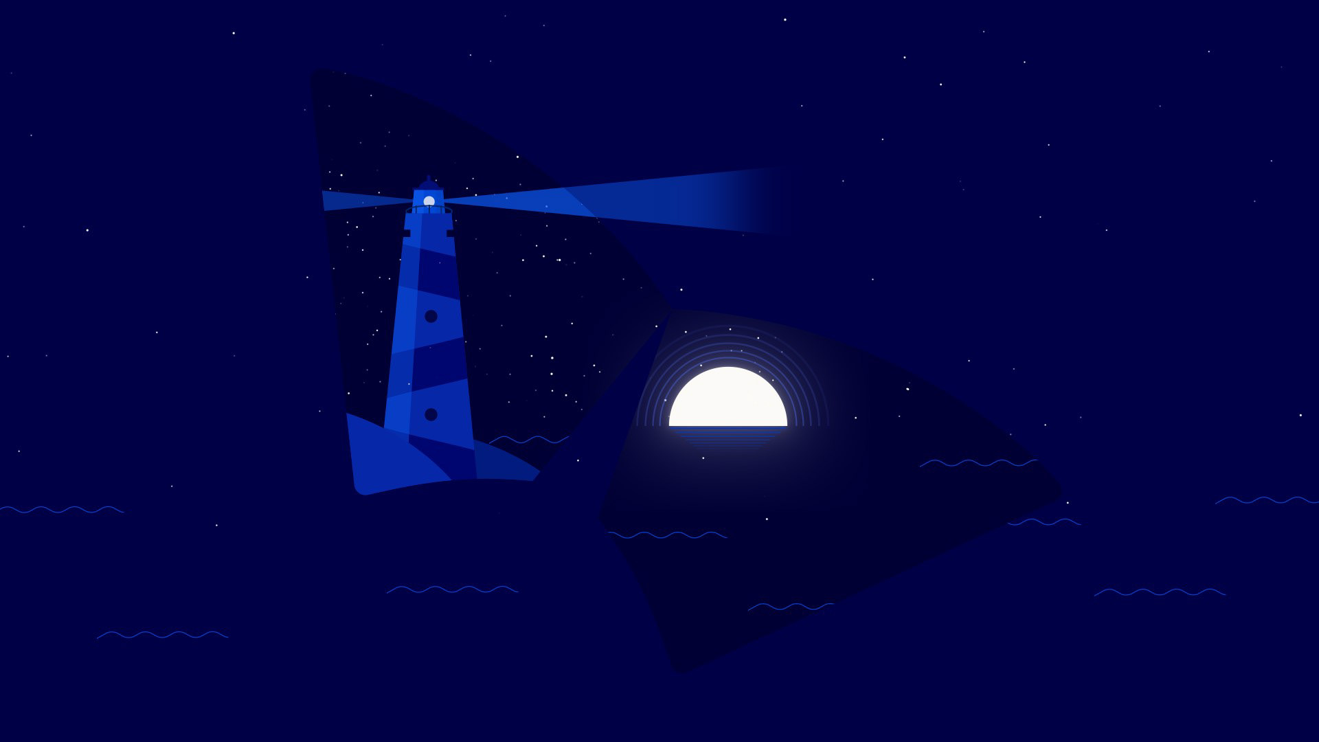
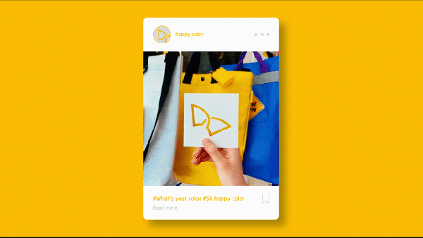
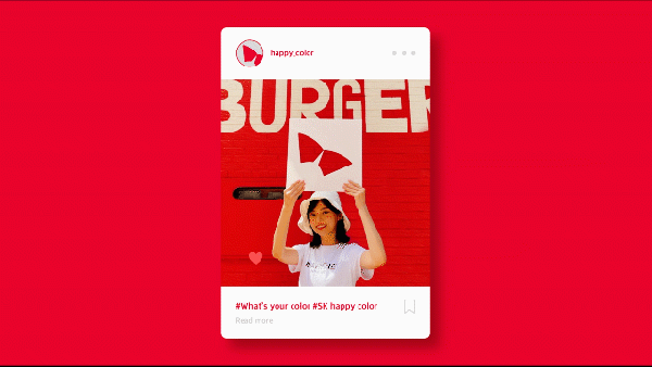
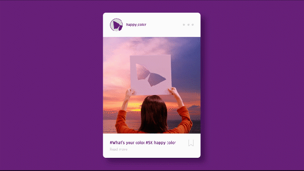
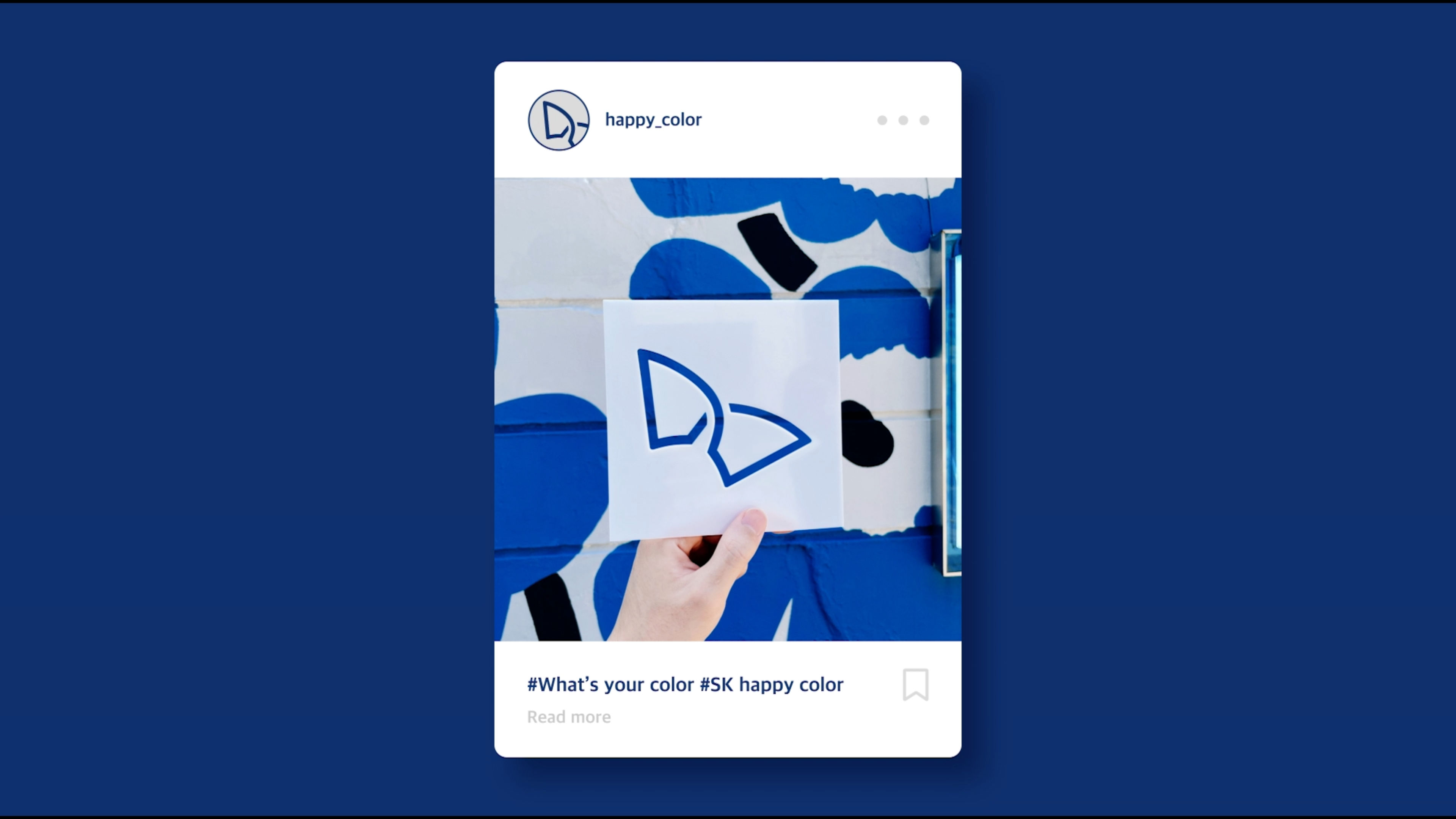
SK has redefined the meaning of the wings of happiness as embodying the appearance of both SK and members of society flying together by pursuing both social and economic values, which are the two pillars of SK DBL (Double Bottom Line) management.
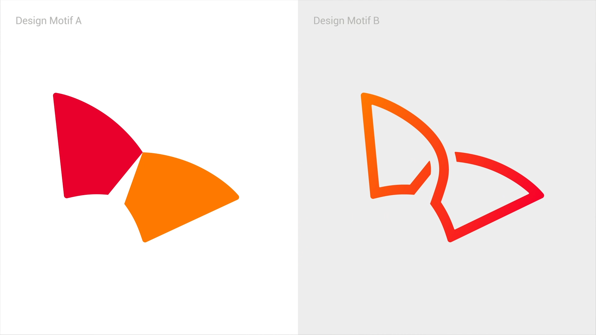
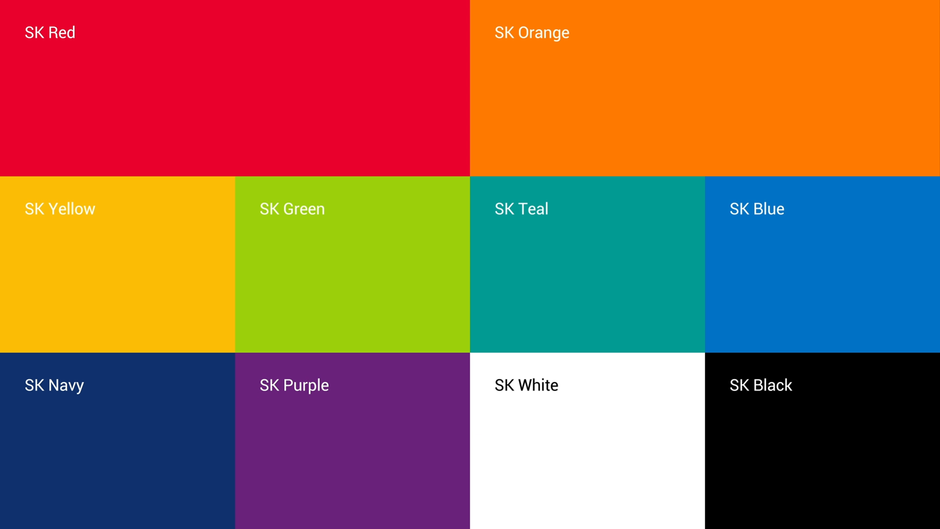
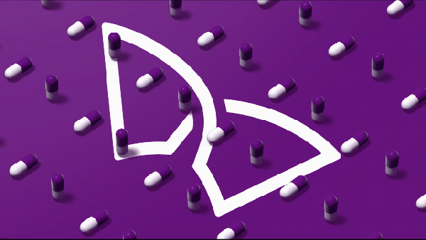
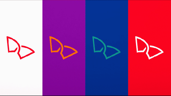
As for the color of the wings of happiness, the current basic color consisting of red and
orange is maintained as the official color, but the color range has been expanded to
a total of 10 colors such as green, which symbolizes eco-friendliness, so that it can be used according to the situation and meaning of various marketing activities and events.
orange is maintained as the official color, but the color range has been expanded to
a total of 10 colors such as green, which symbolizes eco-friendliness, so that it can be used according to the situation and meaning of various marketing activities and events.
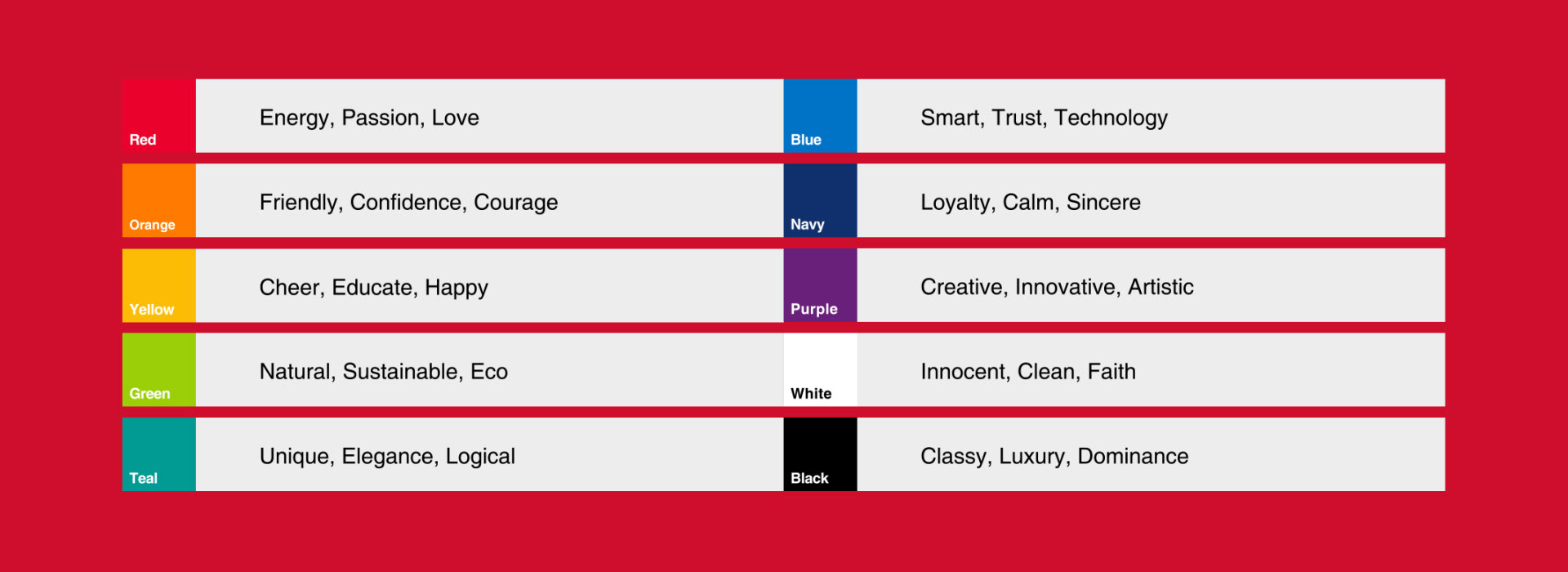
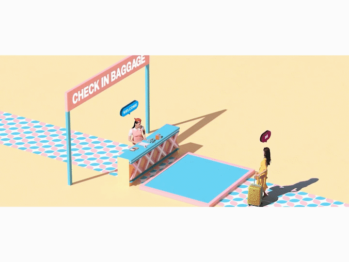
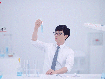
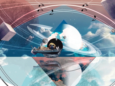
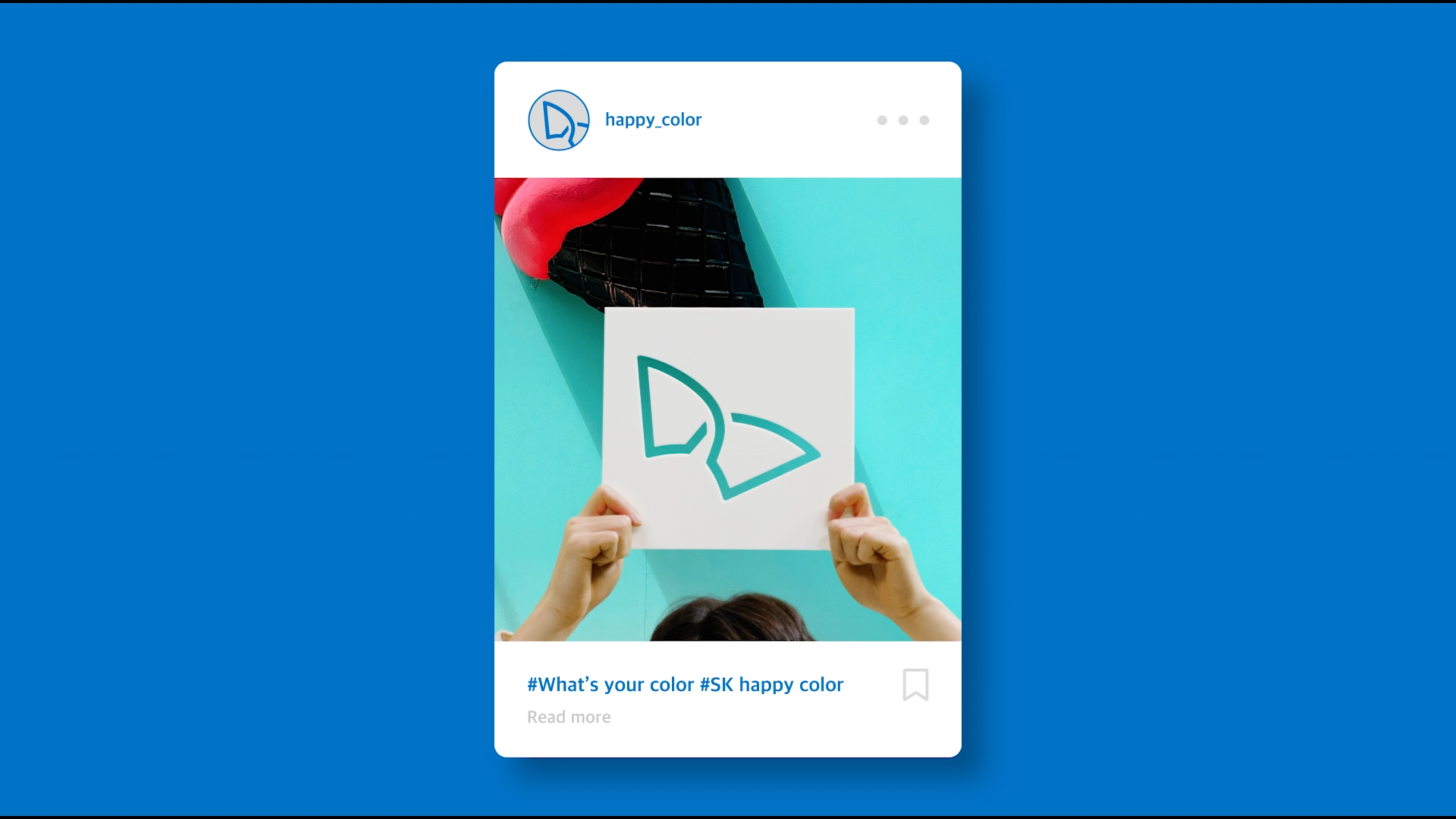
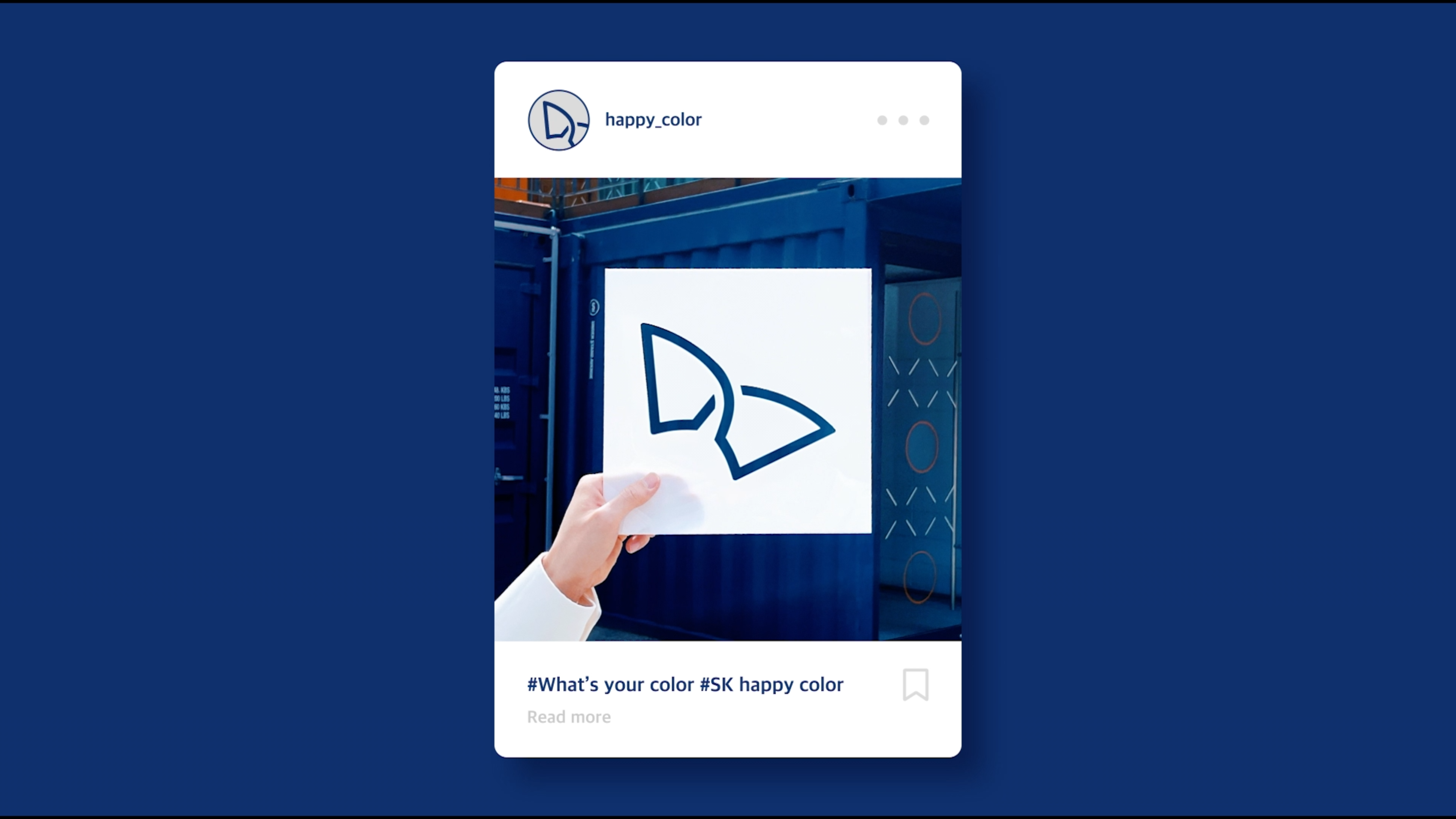
We created key visuals by creating keywords by color.
GIF ANIMATION


R&D KEY VISUAL


SNS DESIGN


Thank you for watching